Want your portrait to look like it belongs in an underground art gallery?
This chaotic ink poster style is trending among digital creators who want something bold, raw, and imperfect. Using tools like Gemini AI or other AI image generators, you can redraw your face with dense scribbles, rough cross-hatching, and high-contrast drama. Here’s how to do it right – without losing your original proportions.
How to Create a Raw Chaotic Ink Poster Portrait:
This style is not about beauty. It’s about energy.
Instead of smooth shading or realistic skin tones, you build the face using uneven black curved strokes. Hair, shadows, and depth come from overlapping lines. The background stays solid orange. The face keeps only a minimal beige flat tone.
However, the key rule is simple:
Use the original image only for proportions – not for realism.
What Makes This Style Powerful?
- Dense black scribble strokes
- Rough cross-hatching for shadows
- Slight asymmetry (avoid perfection)
- Irregular tangled aura around the head
- Flat orange background
- No gradients, no 3D, no polish
Because of this raw approach, the portrait feels emotional, rebellious, and modern.
This technique is popular in digital poster art, album covers, and edgy Instagram creatives. Moreover, it stands out instantly in social feeds due to its bold contrast.
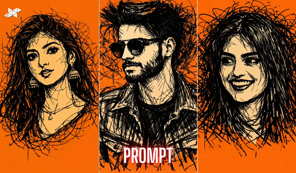
Full Face Chaotic Ink Poster Prompt:
“Redraw the provided face as a raw chaotic ink poster built mainly from dense curved black scribble strokes. Use the original only for proportions. Form hair, shadows, and structure with overlapping uneven lines and rough cross-hatching. Keep minimal flat beige tone on skin. No realism, no gradients, no 3D polish. Slight asymmetry in features. Add an irregular tangled aura around the head. Solid flat orange background. High contrast black and beige against orange.”
What it does: Creates a full dramatic poster-style portrait.
Best use case: Instagram post, profile photo, digital art showcase.
Close-Up Intense Ink Version Prompt:
“Transform the face into an extreme close-up chaotic ink illustration using thick and thin curved black scribble strokes. Maintain correct proportions from the reference image. Build depth using aggressive cross-hatching and overlapping lines. Keep skin in flat beige tone only, no gradients. Introduce slight asymmetry and imperfect detailing. Surround the head with messy tangled ink aura. Use a strong solid orange background. No realism, no smooth shading.”
What it does: Focuses on expressions and raw emotion.
Best use case: WhatsApp DP, Snapchat story, edgy reels cover.
Minimalist Raw Ink Poster Prompt:
“Recreate the face as a minimalist chaotic ink poster using dense, hand-drawn curved black scribbles. Follow original proportions strictly. Use uneven strokes and rough cross-hatching for shadows and structure. Apply only flat beige tone for skin, avoiding realism and gradients. Keep slight imbalance in facial lines for a raw feel. Add a subtle tangled ink aura. Background must be solid flat orange. High contrast, flat graphic style, no depth effects.”
What it does: Cleaner but still chaotic and artistic.
Best use case: Digital posters, art prints, Instagram carousel slide.
Quick Tips for Better Results
- Use a high-resolution face image for sharper line structure.
- Keep expressions neutral or serious for stronger impact.
- Avoid busy backgrounds in the original photo.
- Use frontal lighting to maintain clear proportions.
- If needed, slightly increase contrast before uploading the reference image.
Additionally, test two versions – one with heavier scribbles and one lighter. Then choose the one that feels more expressive.
Conclusion:
This chaotic ink poster style is bold, imperfect, and visually striking. With the right prompt and clean proportions, you can create a powerful artistic portrait that grabs instant attention.
FAQs
1. Can I use any face photo for this ink poster style?
Yes, but use a clear, front-facing image for accurate proportions.
2. Which AI tool works best for this prompt?
Gemini AI, Midjourney, and similar image generators handle it well.
3. Why avoid gradients and realism?
Because this style focuses on raw, high-contrast scribble energy.
Leave a Reply