Want your AI artwork to stop looking flat and start looking cinematic?
This bold “NAME” typography concept is perfect for creators using ChatGPT and AI image tools to generate scroll-stopping visuals. Instead of plain text effects, you’ll create a gritty, double-exposure masterpiece with neon split lighting and dramatic contrast.
Here’s how to turn one word into a powerful visual statement.
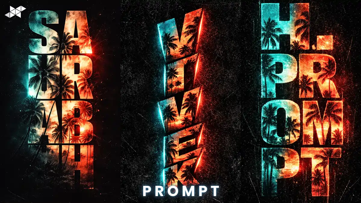
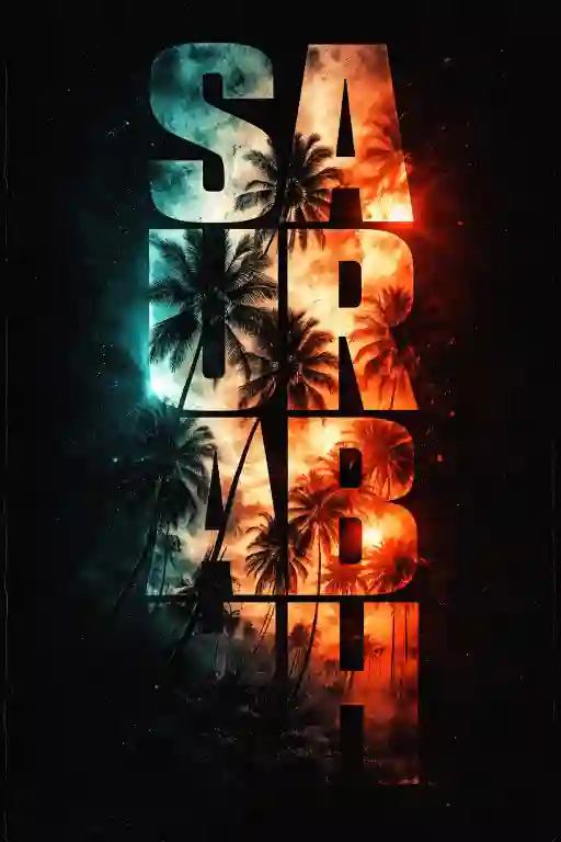
Pose 1: Centered Poster Layout
Prompt in Quote:
“Bold vertical cinematic typography of the word ‘SAURABH’ in a heavy distressed sans-serif font. Letters arranged stacked vertically, ultra-sharp edges. Inside the letters, high-contrast double exposure showing palm tree silhouettes and a dramatic tropical sunset. Sharp split-tone lighting effect: neon turquoise glow on the left side and fiery orange-red glow on the right. Solid pitch-black background. Strong cinematic contrast, visible film grain, subtle scratches, gritty texture, ultra-detailed 4K, poster composition, dramatic mood.”
Why it works: Balanced, powerful, poster-style impact.
Best Use Case: Instagram post, YouTube thumbnail, portfolio cover.
Pose 2: Slight Tilt Cinematic Angle
Prompt in Quote:
“Vertical ‘VIVEK’ typography in bold distressed sans-serif, slightly tilted for dynamic perspective. Letters filled with double exposure tropical sunset and dark palm tree silhouettes. Intense split lighting: neon turquoise highlights on left edges, glowing orange-red rim light on right edges. Deep black background for high contrast. Heavy cinematic grit, film grain overlay, subtle scratch texture, dramatic shadow depth, ultra-realistic lighting, high-resolution 4K editorial poster style.”
Why it works: Adds motion and visual tension.
Best Use Case: Snapchat story, WhatsApp status, reel cover.
Pose 3: Close Crop Dramatic Frame
Prompt in Quote:
“Extreme close-up vertical typography of the word ‘H.PROMPT’ in a thick distressed sans-serif font. Letters tightly cropped within frame, filled with high-contrast sunset double exposure featuring palm trees in silhouette. Sharp split-tone effect: left side neon turquoise glow, right side intense orange-red illumination. Background completely pitch black. Strong cinematic atmosphere, textured grain, light scratches, glowing edges, bold contrast, ultra-detailed 4K dramatic poster aesthetic.”
Why it works: Feels intense and premium.
Best Use Case: Profile photo, cover art, aesthetic story background.
Quick Tips for Better Results:
- Use high contrast sunsets for cleaner double exposure.
- Keep the background pure black for stronger glow separation.
- Adjust grain carefully; too much reduces clarity.
- Increase edge sharpness slightly for a poster effect.
- Moreover, export in 4K to maintain texture depth.
Small refinements dramatically improve the final result.
How to Create Cinematic “PARADISE” Typography:
Strong typography is not just about font choice. It’s about mood, contrast, and storytelling.
This concept works because it blends distressed lettering, double exposure photography, and split-tone lighting into one frame.
Why This Style Works
- Vertical layout adds drama and height
- Heavy sans-serif font builds impact
- Double exposure adds depth and emotion
- Neon turquoise + fiery orange creates tension
- Black background increases contrast
As a result, the word feels alive, not static.
Visual Breakdown
Font Style:
Choose a bold, distressed sans-serif. Texture matters more than smooth edges.
Inside the Letters:
Fill the text with silhouettes of palm trees and a dramatic sunset. Keep it high-contrast for clarity.
Lighting Effect:
Apply a sharp split-tone.
Left side: neon turquoise.
Right side: orange-red glow.
Final Texture:
Add film grain and subtle scratches. Therefore, the image feels cinematic, not digital.
This combination improves depth and gives the design a premium poster look — perfect for Discover feeds.
Conclusion:
Strong typography can carry emotion without extra elements.
When lighting, texture, and contrast work together, even one word like “PARADISE” becomes a cinematic visual statement.
FAQs:
Q1: Best font style?
Heavy distressed sans-serif.
Q2: Why split-tone lighting?
Adds depth and contrast.
Q3: Ideal background color?
Solid pitch black.
Leave a Reply